Lucas DaSilva
Internal Dashboard
Designed & Developed by me ⟢
A custom admin dashboard for jobs, workflows, and customer requests.
The tool recorded the work but never showed its state or helped you decide.
I started with the unglamorous part: sitting with the project engineers who used it daily, listening for
Then I catalogued every field the old tool held: 334 of them, across 15 screens. When I rebuilt it beside the redesign, nothing went missing, and every later scope argument stayed short.
problem statement
How might we let a high-volume ops team see the true state of its work?
Four findings, ranked
01 — The task data was work to do, not numbers to read
Each workflow had a capable board of its own: filter, sort, drag between stages. But the one screen that showed every task at once wasn't that board. It was a read-only jobs table, something you reported on instead of working from.
02 — Nothing said what mattered more
The board already knew who a task belonged to and when it was due, and it could filter and sort on both. It had no concept of priority. Every task carried the same weight, so “what first?” had no answer the data could give.
03 — Overdue work was invisible
They asked for one thing outright: put past-due tasks in red. Nothing on the screen showed that a deadline had passed. An overdue task looked exactly like every task around it.
04 — One dense dashboard, desk-only
The dashboard was a single long scroll built for a monitor. It didn't work on a phone, and the weekly report meant exporting to CSV and rebuilding it in a spreadsheet.
Make the invisible visible, and the visible actionable.
The redesign ranks urgency for you. The work that can’t wait sits on top before you go looking.
State is something you see now, not something you work out. Overdue and at-risk show up as a red pill and a health read, and the aging backlog moves from a buried row to a headline. The screen decides what needs your attention before you ask.
The dashboard becomes a place to read. The task work moves into one view you act from, list or board, with priority added so a backlog that deep can finally be ordered. One place to judge, one place to act.
Exploring outside a template
An engineer building fast reaches for the nearest component library, because shipping is the job and the interface isn’t the bottleneck. Ship it. Move on. The template becomes the product.
It’s not a failure of care. It’s what happens with no designer in the loop and a real deadline.
I worked from the source and kept shadcn as the base layer, then made the calls a library won’t. Semantic colour instead of the default palette. Direction carries the signal on every number, colour only backs it up, so the figures still read in greyscale. A rule marks the selected state, not just a fill.
The library gives you components. It doesn’t give you a point of view.
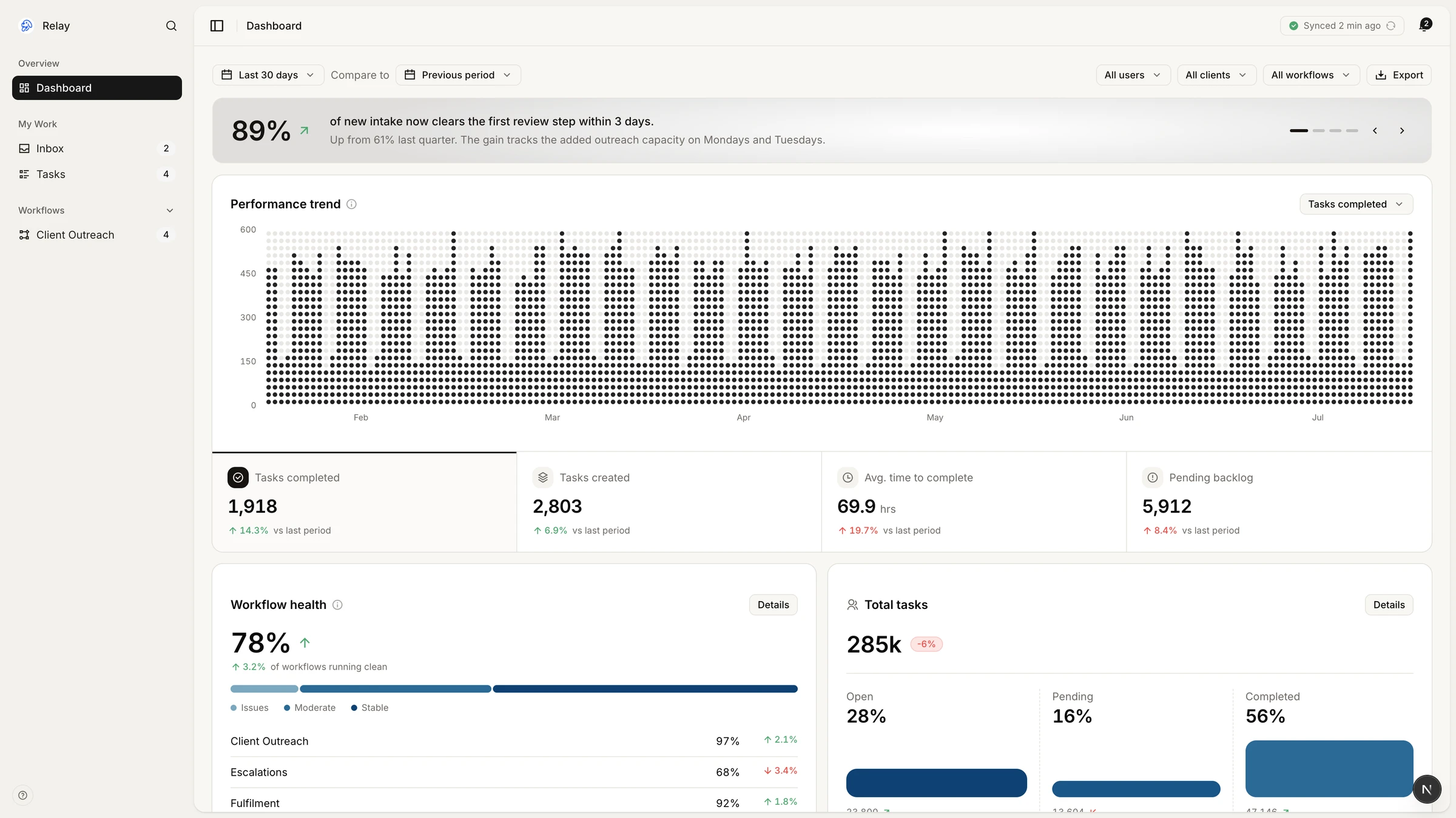
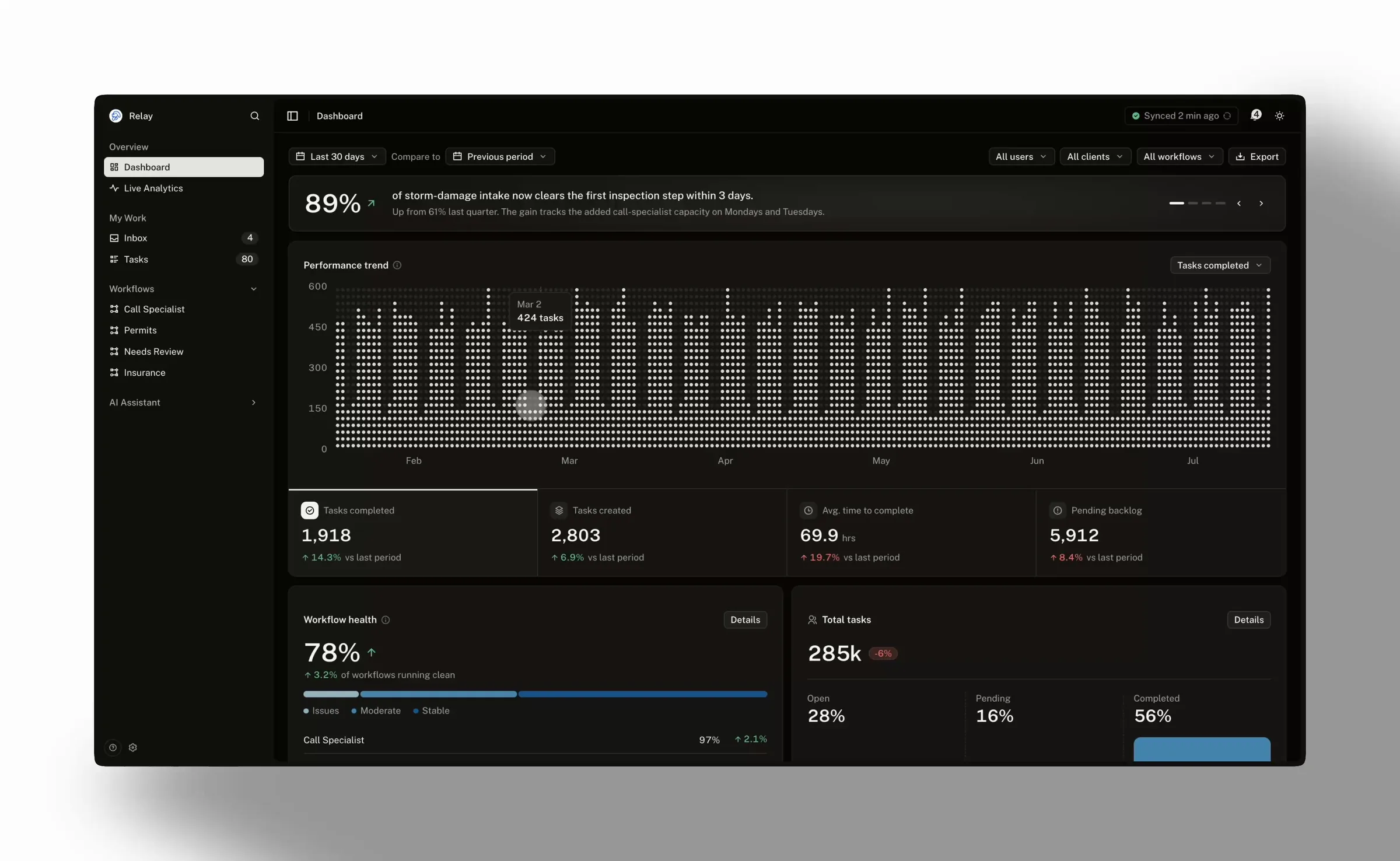
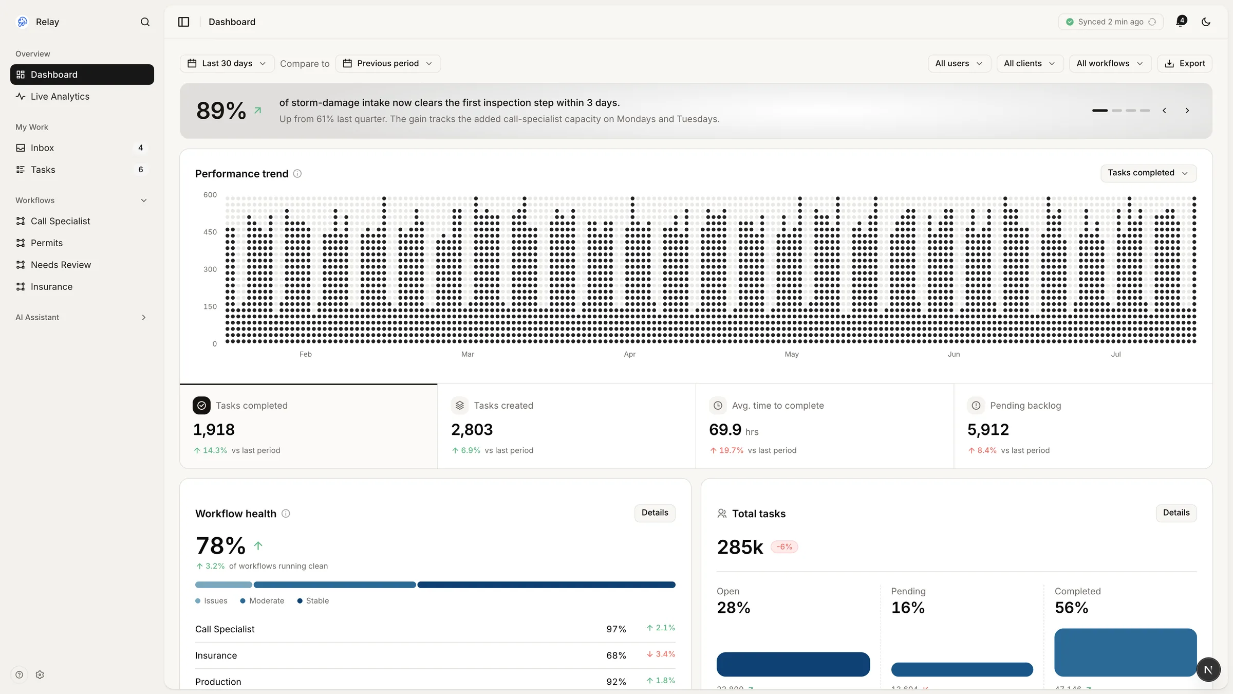
What did they actually need to see?
Not more numbers. The dashboard already had plenty. What the project engineers couldn’t get were the answers the work turned on: what’s late, what to pick up next, and how long things sit before anyone acts.
my goal
Deliver the right amount of context, visuals, and supporting data for users to have trust in their tool.
Before I changed anything, I audited what had already shipped.
execution
Reveal what was hidden, unify what was scattered, and build only what the data couldn’t already say.
A drill-down should look like what you clicked
It opens on the same number and chart the card was showing, then breaks that figure into its parts. Nothing new sits above the fold. You land on what you clicked, over a backdrop that keeps the page in view.
78%
3.2% overall workflow health
Trust was the deliverable
How I’d know it worked:
One dense screen became five focused ones, and all four findings closed in the build. In the end the project engineers didn’t ask for a feature. They asked for the confidence to use it.
The before was more capable than it looked.
The wins I trust most added nothing new. I fixed a broken chart, and I pulled overdue out of a date the app already stored.
Splitting seeing from doing was the call that mattered most. Turning the task list from something you read into something you work from is what changes the project engineer’s day.
Does health help them, or is it noise? Does priority match how they think? I haven’t tested either. I’d treat it as a guess, not a finding.
A celebration on every drag-to-done charms you once, then wears thin by the two-hundredth task of a shift. At that volume I’d quiet it on the repeated action, and save the delight for the rare win: clearing a column, emptying a backlog.